


What in the world is the Group of Twenty (G20)? We have chosen eight indicators to present the most important economic, social, and environmental data and created seven maps and graphics that present this comparison visually and at a glance.
What in the world is the Group of Twenty (G20)? Who are those industrialized and developing economies that together with the European Union (EU) appoint themselves as rulers of the world and whose heads of state will come together in July in Hamburg in order to guide the fade of the world?
Our contribution to answering this question is, on the one hand, to present the most important economic, social, and environmental data of the individual G20 members in three interactive infographics each. These country profiles are located below in the information portal. Each infographic contains menu points where more information can be found. You can also change the size by zooming in and out.
However, these country profiles only describe some aspect of the attributes of individual G20 members. Other interesting insights come to light when directly comparing the performance of the G20 club members by focusing on where the G20 members stand in implementing the priorities of their political agenda.
We thus chose eight important indicators and created seven maps and graphics that present this comparison visually (our particular thanks goes to Michel Penke). When we created the maps and infographics, the database was more or less exhaustive. Whenever working with data, key questions are examined, such as: who collects the data, in which context, what are the underlying purposes, definitions and methods for which the data are collected? Data and statistics are important tools to visualize reality, but they are just that. On the one hand, they can help to isolate essential aspects of the questions asked; make trends visible; and show a snapshot of developments. On the other hand, statistics and databases are always limited; they represent only one source of information to illustrate a complex reality. For our purpose of comparing the G20 members, we were specifically challenged by the fact that data was not always available from the same source for all countries and the EU. It was particularly challenging in the case of the Gender Pay Gap about which many countries do not collect data. Using different sources, however, impairs comparability across countries due to factors, such as the use of different methods used when collecting the data.
What follows are small informational texts that provide background to the maps and serve as an interpretation guide, including by pointing out the limits of the illustrations.
1. Gross Domestic Product (GDP) and Purchasing Power
![]()
The G20 is a self-organized, informal club of some of the strongest economies in the world. In the map, you can see how the gross domestic product (GDP) is compared to the GDP per capita. These data are reflected in “Purchasing Power Parity” (PPP), so that one can compare economic well-being from country to country. Comparing these two indicators helps to visualize the economic power of each country in relation to its population. However, economic power alone does not say anything about wealth and the well-being of the population. What is more crucial is: How is wealth being generated? And, who participates in the generation of wealth and economic strength? Because you cannot eat GDP
2. Development of Income Distribution Over the last Decade (Gini-Index)
![]()
“Inclusive” growth – one goal of the G20 – needs policies of redistribution (among other things) in order for all parts of the population to benefit from economic power. This infographic shows the trends related to income distribution measured with the help of the GINI-Index over one decade. Inequality is a problem with many dimensions; there is not only the inequality between the global south and the global north – but also the patterns of social and economic inequality within individual countries. Inequality can (and often does) increase despite growth in GDP. The graphics show that some developing countries achieved some improvements in distributive justice while income distribution worsened – despite stronger economic growth in the old G8 members as well as in China and South Africa.
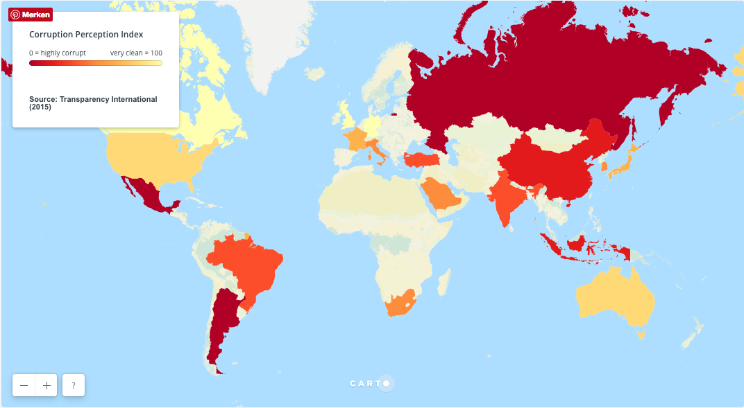
3. Corruption Perception Index
![]() The fight against corruption has for many years been a top priority for the G20. On a regular basis, the G20 designs and attempts to implement action plans to this end. When politicians and public sector workers abuse power for private purposes, it destroys the trust citizens have in politics, in public institutions and in society at large. This disrupts processes important for social and economic development. The Corruption Perception Index published by Transparency International looks at perceived corruption in 168 countries. Among other things, it indicates that about half of the G20 members struggle with severe levels of corruption.
The fight against corruption has for many years been a top priority for the G20. On a regular basis, the G20 designs and attempts to implement action plans to this end. When politicians and public sector workers abuse power for private purposes, it destroys the trust citizens have in politics, in public institutions and in society at large. This disrupts processes important for social and economic development. The Corruption Perception Index published by Transparency International looks at perceived corruption in 168 countries. Among other things, it indicates that about half of the G20 members struggle with severe levels of corruption.
4. Fossil Fuel Subsidies vs. Investment in Renewable Energies
![]()
Subsidizing fossil fuels thwarts climate protection measures and impedes the development of renewable energies worldwide. Already in 2009, the G20 agreed to phase out “inefficient” subsidies. This step is all the more urgent in the light of the commitments by the 2015 UN Climate Summit in Paris to limit global warming to a maximum of 1.5 degrees Celsius. To date, the G20 has been unable to even agree on a definition of “inefficient subsidies”. The graphics contrast investments in renewable energies with fossil fuel subsidies and display the relationship between them.
Please notice that there are many different definitions for a “subsidy”. The definitions differ depending on which data source is used. We have used data of the International Monetary Fund (IMF) that uses a broad definition that includes tax relief and government-funded subsidies as well as the opportunity cost of a potential tax to help recover the costs of environmental damages incurred by energy production and consumption, e.g. carbon tax.
The controversy over phasing out subsidies is closely connected with aspects of social policy making. This is especially true for countries like China, Brazil or India where living costs would soar if subsidies are cut without a social cushion, such as a household subsidy.
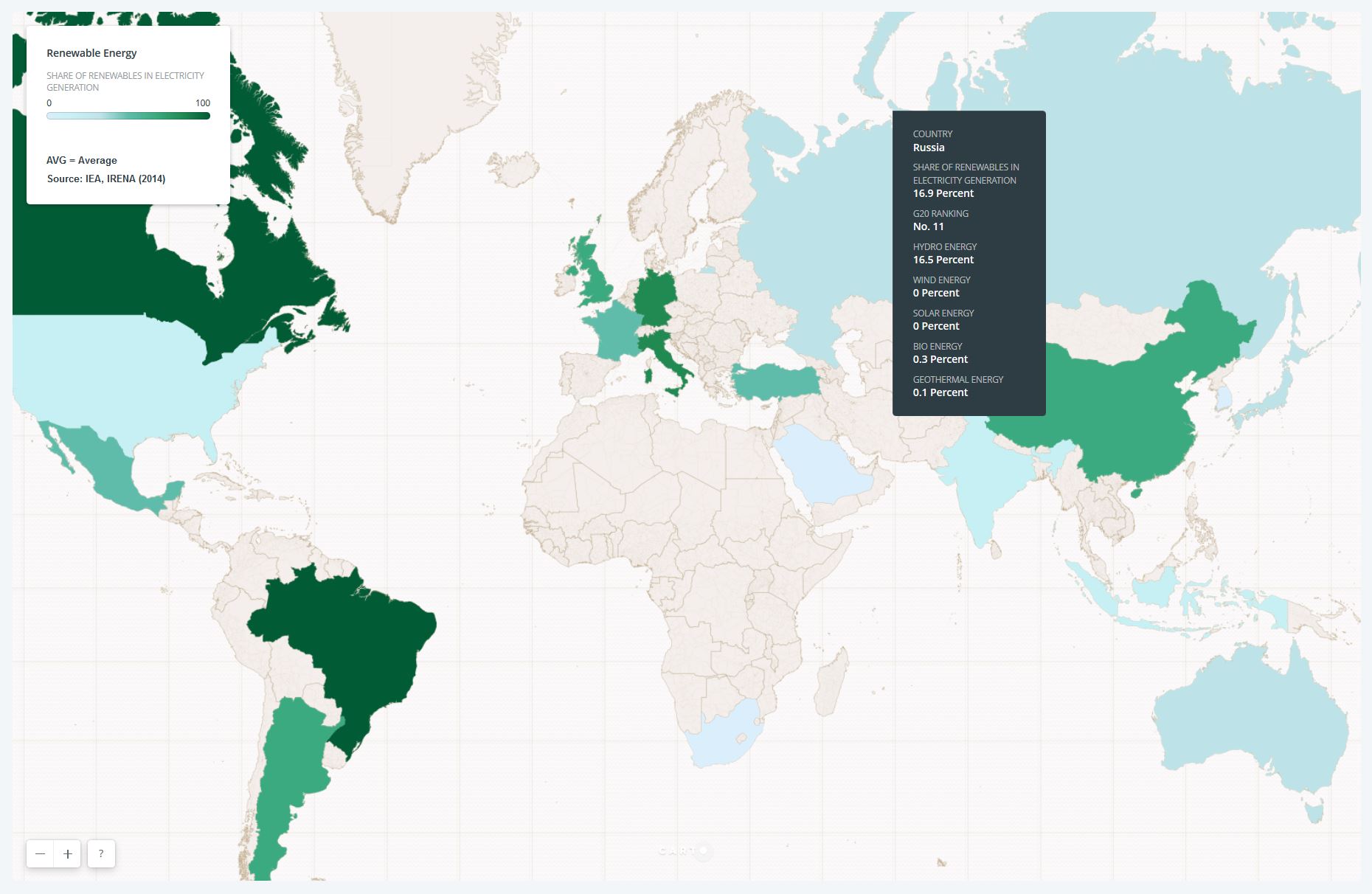
5. Share of Renewables in Electricity Generation
![]()
Because the G20 members produce 75 per cent of global greenhouse gas emissions, it is crucial that they lead the way in the area of energy and climate policies. Phasing out fossil fuels in electricity generation should be a core goal in this regard. The map compares the shares of renewable energy sources when it comes to electricity generation among the G20 members. In the drop down menus, you can see which type of renewable sources each G20 member utilizes.
When assessing a country’s performance, it is important to note that large hydropower stations often cause grave environmental problems, but also social conflicts and human rights violations. Flooding of large areas which are rich with vegetation leads to rotting of the soil and other organic material which emits large amounts of climate damaging gases, such as methane and CO2. Furthermore, in order to build the large dams, entire villages sometimes must be resettled. Consideration of these issues is beyond the scope of the ranking of the G20 members. Thus, it is important to look at which renewable sources are used for the generation of electricity. The third page of our country profiles that examines energy and climate issues is useful in this context.
6. Gender Pay Gap and Women in Labor
![]()
In 2014 the G20 collectively committed to reduce the gender labor force participation gap by 25% by the year 2025 (the 25 by 25 goal) and to that end, it also endorsed the target of creating 100 million jobs for women. But to realize this commitment, a general framework is required that makes it easier for women to reconcile work and family life, e.g., through a fairer distribution of labor between men and women when it comes to “care” work and unpaid domestic work. This is the only way to achieve continuous employment of women and men in different phases of life and a balance between life and work. These matters are ignored in the implementation of the G20 commitment. And the same happens with the existing difference in pay between men and women that is measured by the Gender Pay Gap. Employing more women can easily result in offering additional low wage workers. In the light of growing automation and digitalization, the G20’s job creation agenda is not forward-looking. We call for structural changes which ultimately end the externalization of reproductive labor that is a basis for creating value in capitalist markets.
We wanted to know where the G20 themselves stand with implementing gender justice in the labor market and, thus, one infographic contrasts the share of women in the labor force with the Gender Pay Gap. This income gap shows the average difference (by percent) between men’s and women’s hourly earnings. The data are collected from several different sources. There are many reasons for the Gender Pay Gap; e.g., women work part-time more often than men; men’s incomes are often higher even if women do the same work in the same position; statistics show that private business women often earn less money for their services than their colleagues. Furthermore, women often take more career breaks due to pregnancies or in order to care for family members.
7. Global Consensus for Decent Work – ILO Core Conventions
![]()
The core conventions of the International Labor Organization (ILO) secure the basic rights of workers around the world. These include the abolition of child and forced labor, the right to free association (e.g., forming unions) and the right to collective bargaining as well as equal remuneration and the absence of discrimination in the work place.
These core conventions represent a global consensus which should guarantee decent working conditions and protect workers’ basic rights worldwide. The infographic shows the different levels of adherence to these international conventions by G20 members. Ratification or non-ratification of the ILO conventions however does not necessarily reveal anything about the real working conditions in a country. Commitments on paper are notoriously accommodating.
The overview provides insights into whether or how the G20 members stick to international commitments and how serious they take binding obligations of these conventions.
This article is part of our dossier "G20 in Focus".